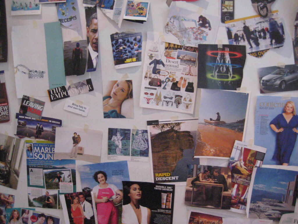
Long a favourite of professional designers, mood boards are a curated collection of random images, words and textures brought into focus by a single reference point.
They allow designers, creative directors and facilitators to capture or convey moods, feelings and other intangible qualities which can be difficult to communicate in words. They’re excellent collaboration tools too, giving you and your team (or client) the chance to agree on direction, positioning or themes at the beginning of a project by creating together an emotional relevancy to a project or service.
I like mood boards as tools in brainstorming and creative problem-solving. They can be used by a team or facilitator as an icebreaker activity or a springboard to idea generation. They are useful to help a group of people understand a target audience beyond a stereotype by illuminating their lives in photographs and visuals. And, more people who have a hard time expressing themselves in words, mood boards help articulate to others what they ‘see’ in their minds – such as a client, their teams, brainstorm participants, even vendors.
Here are my best tips on creating and using mood boards.
How To Make a Mood Board in 10 Steps
You can’t make a bad mood board, but there are tips to make them more effective.
1. Decide your purpose.
First, be clear on the point of the mood board. Is it created to help with a brainstorm? Are you going to use it beforehand, to understand the target audience, or afterwards, for a client meeting or pitch presentation? Is the client in the same city as you, or are they elsewhere? The answers to these questions will help you choose the best and most effective medium.
2. Choose your white space.
Start with these questions: Do you want it to be stationary, or will you want to move it around? Or, will you want something online?
- If the mood board is stationary, perhaps a one-time-use-only activity, like a brainstorm, a conference room wall is an obvious choice. I’ve also hung them in public areas of a client or an agency, such as a broad hallway, in the cafeteria, even the kitchen where lots of people will see it.
You can involve more than just the people in the brainstorm by making them public and encourage people to contribute. By hanging a mood board out in the open, you invite others to see it, add to it, or comment on it. They’re great to spread the creative spirit into the culture of the organisation. The biggest issue of course is to think in advance whether your mood board hanging in a conference room will be in the way for participants in future meetings. (You don’t want to find out you’re hung everything up only to have to take it down again.)
- If you want your mood board to move – say, for a presentation – you need to purchase an appropriately sized foam-core panel or similar non-flexible board from an art supply store and a few cans of good repositionable spray mount.
If you’re new to spray mount (how?!?), know it comes in permanent and re-positionable. Make sure you read the label to know the difference! If you don’t, it’ll be a hard-earned lesson.
Size will also be a key. Are you going to present it with your noses directly in front of it, or will it need to be in the front of the room, or will you want it small so you can pass it around the meeting for everyone to see up-close.
Online mood boards offer even more flexibility, especially if some of the participants or clients are elsewhere. Click the button below to jump to specific suggestions for online collaboration resources.

3. Gather your tools.
You’ll begin by attaching elements to your off-line mood board. You have three options, depending upon the style you’ve chosen.
- Cellophane or sticky tape. Get a table-top tape dispenser so you can keep your hands free. It’s also faster. If you have the option, I prefer low-tack tape so I can easily move things around.
- BluTack or similar clay. Be careful if you’re using one-of-a-kind pictures because some clay can leave a greasy residue.
- Spray mount. This spray comes in both permanent and re-positionable.
Some other items to have at hand:
- Scissors, X-acto knives and cutting boards. (Self-healing cutting mats are perfect.)
- Post-its, in different sizes and colours
- Markers, pens or textas to write words or instructions
- String or yarn if you want to create lines or connections between random images or words.
4. Think like an editor or curator.
Before you put a single image on the mood board, think of yourself as a curator, or the mood board’s editor. You don’t want a mood board that’s just an erratic collection of images. If it is, your viewers will struggle to make sense of your mood board. Good mood boards have focus, an opinion, or a point-of-view.
5. Begin with an anchor.
Start with a compelling word or an evocative photograph – called the anchor – in the centre. As you and your team members add new elements (pictures, words or textures), think about how each piece will add to, or complement, the anchor or its subsequent elements. You can absolutely add elements which are out in left-field, but separate these other images slightly to keep some perspective. Or, use Post-its as signposts to help the viewer connect your story as you add images.
There have been times where one mood board has several concepts to explore. If so, consider doing different or separate mood boards at once. Or, if you’re using a wall, split the mood board and create different areas. I might have one theme go left of the anchor, and another theme building to the right. But remember: you are its curator. Edit and consider each piece so your final mood board has a point-of-view. Or, use the group to make these decisions. It’ll help build understanding and agreement among the team.
6. Build upon the anchor.
There are two basic elements of mood boards: images and words. Think how you can tap into other senses beyond visual and oral.
Textures add a tactile emotion, if not actual items from the target audience. For a grocery mood board, we included samples of housewives’ shopping lists and check-out receipts. For destination travel, we added souvenirs that people buy as a memories of their holiday.
You can also stimulate the senses of taste and hearing by having appropriate music and food available while you/your team works together.

7. Go beyond Google Images.
It’s easy to open Google, print out some images and be finished. However, remember those same photos are used by someone else (a rival agency?) with little interest to dig deeper. Instead, use good internet databases of images to help refine and expand your search. Many of these sites are also great tools for alternative brainstorming exercises. Two websites I like to curate images are below:
8. Get the hands engaged.
Digital is great, but I always prefer getting the hands engaged. (See why by clicking .) I like to get people involved by having them rip, cut and paste in the room prior to, or during, the brainstorm. That’s why I never throw away a magazine. Get to know where the best news agents or magazine stores are in your neighborhood to buy specific marques to fit a theme, audience or industry. When I’m out on weekends and see a big stack of older magazines, I buy them to have on hand for future mood boards and brainstorms.
9. Use your smart phones.
The great thing about creating mood boards today is that everyone now has a camera with them on their phones. (Even better if they have a removable SD card.) In advance of the brainstorm, I ask people to bring in 10-20 photographs on a particular theme between going home tonight and coming back tomorrow. Or …
10. Send people out on a field trip.
Bring everyone together, give them a photography assignment, and send them out on the street to take a specific number of pictures. (30 minutes for 20-40 photos is about average. You might have to remind them they’re not Ansel Adams. You don’t want them labouring over one perfect shot.) They can also do this task as a pre-meeting exercise, or as an icebreaker to start the brainstorm. (Taking into account a , you might use your mood board as a re-energiser for a brainstorm or strategy meeting.)
How to use the mood board for brainstorming
Once the mood board is finished, take a step back and look at it as a whole. Here’s some questions to prompt brainstorming.
- What themes come out, or repeat? How can we re-create these themes in our ideas or tactics?
- What behaviours do we recognise? What types of activities (or tactics) will encourage our audience to repeat that behaviour, or at least justify it a second time?
- Do we notice any trends? Is there anything here that we can capitalise on now, or promote to our audience as opportunities?
- What images, trends or opportunities can we leverage?
- Are there issues? Among these images, are their negative issues which we should address, eliminate, or put into context for our audience?
- What sort of tactics might have started these choices or behaviours from our audiences?
- What types of things might be created to compel the audience to interact with our client and/or its products/services?
- What type of activities does our audience relate to, or participate in?
- What brand characteristics do we see here that relate to the client, and how can we turn them into either tactics or messages?
How to use mood boards in presentations
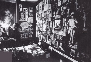
(At right, a view of a mood board by the legendarty editor of Vogue, Diana Vreeland.)
1. Incorporate them into your pitch.
If you’ve gone to this much work to use mood boards for brainstorms, you should definitely look for ways to incorporate them into your pitch.
I take photos of the mood board and add them to the pitch as visual interest, if not as wallpaper for a PowerPoint template. I unveil them during key moments in the pitch – in support of a strategy or the overall core concept. If the big mood board is too big to pass-along in the pitch, I distribute smaller photos for people to look at. (I prefer not to pass out larger boards because they distract from the presentation.)
This may not work for every presentation, but several times I’ve asked a junior client member help co-present to give the mood board a subtle ring of endorsement.
2. Think about how you’ll sell the story of your mood board.
Mood boards can be an eye-blur for some clients, so consider how you’re going to walk your client through its creation and story.
When most people look at a collage, they try to find a spot to begin. Where is yours? Or, give them a visual starting point.
Your anchor – or mini-anchors – should be prominent in some way. The story should lead from these points, and end in a discovery or a solution, which in turn must lead to an insight, which suggests a strategy or an idea.
That’s another reason why you want to curate your mood board. If it looks like a scramble of images, your strategy and ideas will look disorganised as well. Be more obvious than obtuse.
One of my favourite lines about mood boards is this: It’s not a game of Pictionary.
3. Think about placement.
Consider the best way to display your mood board. Easels – either floor or table-top – are good, but will they get in the way of presentation or flow? How will you unveil it? Will you need as co-presenter to help juggle presenting and unveiling? Don’t look uncoordinated.
4. Watch for confusion.
First, the mood board should enhance the discussion, not distract. That’s true not only of the audience members but you the presenter.
For the audience …
- Watch out for facial expressions. Are they confused? Are they following you? Are they more focused on the boards and you?
- Some people may not be as visually focused as you, so provide other materials to enhance the presentation (reading materials for example). You might also “test drive” the mood board with someone who thinks differently than you to get someone else’s perspective.
For the presenter …
- Don’t get so caught up presenting the mood board that you ignore the audience. Eye contact is still necessary even with visual props.
- Think about how you will present or ‘set-up’ the board. Don’t overexplain your board. Visually, it should (mostly) speak for itself. (And, it’s OK to put a few words on the board. It doesn’t have to be pictures only.)
Online Mood Boards
With colleagues and clients often located elsewhere, or you simply want to take advantage of the amazing tools and features available via online collaboration websites, creating mood boards online couldn’t be easier.
Miro or are two of the most well-known sites, for good reason. Comparing them can be a little difficult if you haven’t worked on either platform, so this website article might help you decide.
Here’s a short list of online resources which friends and colleagues prefer. (Some of these links may automatically default to Australian locations.)
Feel free to also check out I pulled together for my Design Thinking workshops.
Any other suggestions to use a mood board? Any other social media sites you like for gathering images or words? Please add your recommendations and suggestions below.


1 Comment
Great article, thank you!